
*
Beowulf Boritt is busy.
The Broadway and Off-Broadway scenic designer has had an active fall season, with three shows — Grace, Chaplin and If There Is I Haven't Found It Yet — that have attracted notice for their non-literal, non-naturalistic designs.
Boritt received a Tony nomination last year for The Scottsboro Boys, and his other credits include Sondheim on Sondheim, The 25th Annual Putnam County Spelling Bee, LoveMusik, The Toxic Avenger, The Last Five Years and the current hit musical Rock of Ages. He has worked for the Roundabout Theatre Company, Manhattan Theatre Club, the Public Theater, Second Stage, the Vineyard Theatre and regional theatres across the country. We got together with him to talk about his creative process — how he conceives his ideas, and how he brings them to fruition.
So let's start with If There Is I Haven't Found It Yet, the Jake Gyllenhaal starrer, at the Roundabout Theatre Company's Laura Pels Theatre. It's about an overweight 15-year-old girl whose teacher mother transfers her to the mom's own school to try to keep her away from bullies. There's a connection in the play to global warming , and there's a set full of water, starting with rain dropping curtain-like across the front of the stage, a trough, then actors sloshing across the stage through water, and scenery that winds up in the trough.
Beowulf Boritt: When I read Nick Payne's play, and when I first talked with Michael Longhurst, the director, what really excited me was that he wanted to take a conceptual approach and do something non-literal. The base story is a simple domestic drama, but obviously the larger framework is the question of global warming and what do we do about it. And you can try to illustrate the difficulty of that but also illustrate that by the difficulty of dealing with simple domestic problems that are a little more understandable.
| |
 |
|
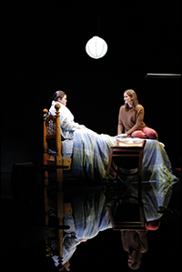
| A view of the water reflection in If There Is I Haven't Found It Yet. | ||
| photo by Joan Marcus |
When I read through the script again I thought the obvious place to do it is in its suicide moment — in the bathtub — there is literally water called for in the script. You could probably do it without that, but that's sort of the tipping point of the story, when suddenly a problem you've been able to ignore becomes unignorable. I said that we could have this bathtub overflow and flood the world, basically.
We went through a bunch of different ideas on what the surround would be. We always wanted to do something simple and abstract. Early on I did a version that was a big iceberg made of plastic water bottles, as some sort of poetic reference to the melting icecaps. We looked at it, but it felt a little heavy-handed. And why is this big mountain sitting there if it's never going to do anything in the play?
That's when we got down to this very simple non-set surround, trying to do something that felt as non-present as possible. This dark blue carpeted box. I said to Mike that if we were going to do water I wanted to do a carpeted set because that feels like the last place in the world you should put water, and it doesn't telegraph that the space is going to be flooded.
| |
 |
|
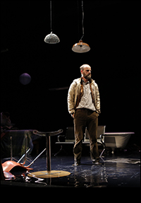
| After the onstage flood | ||
| Photo by Joan Marcus |
And we introduced with the Jake Gyllenhaal character someone who's less concerned with living ecologically. He starts throwing things away as he doesn't need them. It has the practical effect of clearing the stage a little bit, and has a dramatic effect. When he first knocks over the museum piece you don't really see it coming. People first think it's an accident, and they're kind of shocked when he throws it in the water. It seemed relevant to his character, but it's just a good device. It helps make the point throughout of stuff piling up.
The last thing I'd say is that in the early drafts of the script — and this changed fairly early in previews — the opening monologue was all about New Orleans and the Katrina floods, which makes it appropriate for talking about today [Monday, Oct. 29, as Hurricane Sandy was approaching the New York region]. We sort of create, by the time the stage floods, this post-hurricane flood-scape where you've got all this stuff sticking up out of the water. The ruins of these characters' lives. And at some point the playwright decided the monologue was just too heavy, it started the play on such a heavy note. And he jiggered the script around so the opening monologue is lighter-toned. You get global warming references [elsewhere]. I was sad to lose the Katrina reference because it made the look of the set very poignant at the end. But hopefully it's very poignant anyway.
| |
 |
|
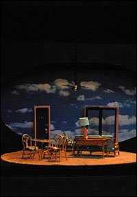
| A model of the Grace "pre-set" |
BB: That was the design following practical needs. We needed some sort of wall in front of the stage to keep the water from flooding into the audience. So I designed that trough and proscenium all out of Plexiglas that was meant to mirror the museum scene and make the comment that in the museum we're looking at the skull of an extinct animal, and to an extent in the story we're looking at people who may go extinct if they don't change their behavior. I don't think that's a point I expect people to take literally, but it's there in the design.
In the early scenes there are lots of references that it's raining outside, so I thought that instead of doing a curtain at the top of the play let's do a curtain of water and have it raining during the pre-show and get the idea of water as a thematic element there early on.
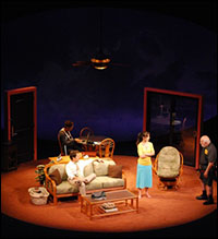
Let's move on to Broadway, and Craig Wright's Grace, with Paul Rudd and Michael Shannon, directed by Dexter Bullard. Here's a story, set in two identical next-door condominiums, of the decline and fall from grace of a born-again Christian. A very down-to-earth, realistic tale. And your set, which constantly revolves, is one, not two, condo apartments, filling in for the two. There's typical Florida-style bamboo furniture, a sliding-glass and a regular door, a fan turning overhead, and a dark blue backdrop with an oval cutout of the sky and moving clouds, suggestive of a coming storm. Why this? And why one room for two?
BB: That wasn't my decision. It's in the script. Craig wrote that it was two plays done in a single space. Dexter actually directed a production in Chicago that they staged that way. That was the conceit of the play, that you have these people that were in the same space and yet separate spaces. That's sort of a metaphor for life and how you approach life in the play.
| |
 |
|
| A scene from Grace | ||
| photo by Hermione Lanoir |
Pushing further into the idea, when you're in moments of emotional stress, or a heightened emotional moment, the world seems to come unmoored a bit, the room may feel as if it's spinning around you, your whole life may feel like it's spinning around you, and it gets kind of disorienting. Much of the play takes place in this kind of situation, and I felt it would be interesting if the world continually disoriented them, so the turntable is continually spinning throughout the play — it never stops except for scene breaks. And there are two doors that rock back and forth on a 180-degree axis. The relationship of these doors to the rest of the set is constantly changing. And then upstage we've got a big sky that starts with this big cloudburst, a kind of sunburst image, a quasi-religious image but also a dramatic image. I think you can read it either way. In the course of the play that slowly tracks away and you get a cloudy sky, and then just a clear blue sky, and the clouds start coming back, and in the final moments of the play the sunburst imagery appears again.
The way we did that is that the backdrop is 140 feet long. It's this enormous gauze curtain with the sky imagery painted on it that very, very slowly tracks past upstage. It was quite an engineering feat to get that to work, because a curtain that big moving that slowly constantly wants to wrinkle. I luckily had top-notch crewmen and technical people who made that work for me.
| |
 |
|
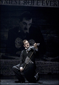
| Rob McClure in Chaplin. | ||
| Photo by Joan Marcus |
BB: It was an interesting challenge. There were a bunch of challenges on Chaplin. We started the whole process relatively late for putting together a big musical, and we had a tight budget. It was still quite a bit of money. We had to find some way of doing a splashy Broadway show as economically as possible both in terms of money and space. The Barrymore Theatre is not typically a musical house. There's not a lot of wing space and the stage is shallow for a musical.
After the fact, doing it in black and white feels like a no-brainer. How could you not do a Charlie Chaplin musical in black and white? In an early meeting I had with the director, Warren Carlyle, we sat down and kind of designed the whole show in two days in a café on the West Side. We talked through it scene by scene and I sat there and scribbled stuff on a yellow pad and 60-70 percent of what's onstage now basically came out of these conversations. And at some point halfway through we said, what if we do it all in black and white? There was no discussion beyond that. We said, well, yeah, it made sense.
It becomes about contrast, and trying to get little bits of silver sparkle in there to heighten the contrast.
| |
 |
|
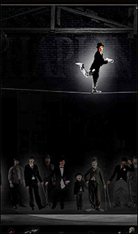
| Boritt's sketch for the Chaplin Act One Finale |
Obviously in the course of the show we do break that a little bit. There's a red rose that tracks through the show that's the symbol of Charlie's mother and his love of acting and creating characters. And then at the end, when we get to the Academy Awards, and suddenly the whole world turns red — red curtains rise up out of the floor and a red carpet rolls down and all the characters reappear in colored versions of their costumes. It's technically quite challenging. There was a day at the scene shop where we painted some of the backdrops on a piece of unbleached muslin. It's basically a white fabric but there's a little bit of yellow to it because it hasn't been bleached. Even though there was black and white paint on top of it, that little bit of yellow showed through, and it started almost looking as if it was Day-Glo yellow. We had to go back and repaint the backdrops on a bleached fabric.
| |
 |
|
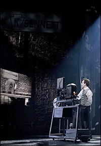
| Rob McClure in Chaplin. | ||
| Photo by Joan Marcus |
BB: That's absolutely where it comes from. It's weird to see Charlie Chaplin in color, because we know him as a black and white figure. That's what really led to the choice.
Tell me a little bit about yourself — where you were born and grew up, how you decided to become a stage designer, how you learned your craft and how your career began.
BB: I was born outside Boston, in Concord, MA, but grew up all over the country. My father was a history professor and until I was 10 we lived someplace different almost every couple of years. My parents finally settled in Gettysburg, PA. I studied drama at Vassar in the 1990s — a literature-based degree. I wrote a thesis about Hamlet. I came to New York for graduate school — NYU's Tisch School of the Arts — and stuck around.
I honestly don't think I really meant to become a professional designer. I'm a little disingenuous for saying that, but I don't think I thought it was possible. I don't know if there was ever a moment where I said I'm going to pursue this. I thought I might become a college professor and teach set design somewhere. To do that I needed a master's degree. I started designing around the city a little bit while I was in graduate school and one thing led to another and I had a number of lucky breaks and started building a career.
What's next — what are you working on now?
BB: A bunch of things. Exciting stuff. I'm doing Prince of Broadway for Hal Prince, his version of Jerome Robbins' Broadway. Hal Prince's greatest hits. A couple of songs each from his most famous pieces. We were planning to do it this fall, but he ended up switching producers, and it's been pushed off for a year, so we'll do it about nine months from now. It's an interesting challenge to take a little bit of Sweeney Todd, a little bit of Phantom of the Opera, a little bit of Fiddler on the Roof, and all of that has to work together. It's great — I never thought I'd ever have a chance to work with Hal Prince on any of these shows.
What's the origin of your somewhat unusual first name?
BB: I was born in the 1970s and I could have had a lot of weird names, so I'm lucky it wasn't any weirder! View highlights from Chaplin:


